Design-based graphs for seven experiments
design-based-graphs.Rmd“Visualize As You Randomize” works through seven experimental
designs, showing a strong and a weak graph for each (PDF, DOI). This vignette
reproduces those examples. The data are the chapter’s own, simulated and
shipped with vayr, so every figure here can be compared
against the printed one.
The chapter offers three guidelines:
- Invite visual comparisons across randomly formed groups, not across groups formed pre- or post-treatment.
- Show the fitted statistical model, with uncertainty estimates, in data-space.
- Use visual cues like colour, shape, diameter, transparency, and facets to reveal design features like blocking, clustering, or differential probabilities of assignment.
The second guideline is what vayr was built for. Laying
the model over the data means the data have to be legible first, and
experimental data collide: outcomes are often discrete, and points often
differ in size once they carry a weight or stand for a cluster. Five of
the seven examples below use a vayr position adjustment for
one of those two reasons. The other two need none, and say so.
library(dplyr)
library(estimatr)
library(ggplot2)
library(marginaleffects)
library(patchwork)
library(tidyr)
library(vayr)

theme_set(theme_bw())
theme_update(
  strip.background = element_blank(),
  legend.position = "none",
  plot.title = element_text(size = 10, face = "bold")
)
A two-arm trial
The simplest case. Five hundred subjects, 100 of them treated, and a binary outcome. The strong graph shows the two group means with their confidence intervals sitting on top of the subjects those means summarize. The weak graph is a bar chart, which shows the same two numbers while discarding the sample size, the spread, and the uncertainty.
Every subject sits at 0 or 1, so the raw data are 500 points stacked
on two positions. position_sunflower() spreads each stack
into a disc whose area grows with the number of subjects in it.
summary_df <-
  two_arm_trial |>
  group_by(condition) |>
  reframe(tidy(lm_robust(Y ~ 1))) |>
  mutate(Y = estimate)

good <-
  ggplot(two_arm_trial, aes(condition, Y)) +
  geom_point(position = position_sunflower(density = 60, aspect_ratio = 1.55),
             alpha = 0.2, stroke = 0) +
  geom_point(data = summary_df, size = 3) +
  geom_errorbar(data = summary_df, aes(ymin = conf.low, ymax = conf.high), width = 0) +
  scale_y_continuous(breaks = seq(0, 1, 0.25)) +
  coord_cartesian(ylim = c(-0.15, 1.15)) +
  labs(title = "Shows the model and the data", x = NULL, y = "Outcome [1 = yes]")

bad <-
  ggplot(summary_df, aes(condition, Y)) +
  geom_col() +
  scale_y_continuous(breaks = seq(0, 1, 0.25)) +
  coord_cartesian(ylim = c(-0.15, 1.15)) +
  labs(title = "Shows the model only", x = NULL, y = "Outcome [1 = yes]")

good + bad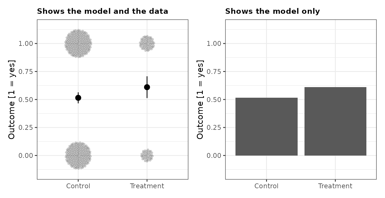
A blocked experiment
Twenty-five residents are treated in each of two neighborhoods. The neighborhoods are different sizes, so a resident of the smaller one is treated with probability 0.5 and a resident of the larger one with probability 0.25. Ignoring that difference biases the estimate.
The strong graph maps the inverse probability weight to point size,
so the subjects who stand for more of the population are drawn larger,
and it weights the model by the same quantity.
position_circlepack() is the adjustment for over-plotted
points of differing size: it packs them rather than letting the large
ones bury the small ones.
weighted_df <-
  blocked_experiment |>
  group_by(condition) |>
  reframe(tidy(lm_robust(Y ~ 1, weights = 1 / Z_cond_prob))) |>
  mutate(Y = estimate)

unweighted_df <-
  blocked_experiment |>
  group_by(condition) |>
  reframe(tidy(lm_robust(Y ~ 1))) |>
  mutate(Y = estimate)

good <-
  ggplot(blocked_experiment, aes(condition, Y)) +
  geom_point(aes(size = 1 / Z_cond_prob),
             position = position_circlepack(density = 0.03, aspect_ratio = 1),
             alpha = 0.2, stroke = 0) +
  geom_point(data = weighted_df, size = 4) +
  geom_errorbar(data = weighted_df, aes(ymin = conf.low, ymax = conf.high), width = 0) +
  scale_size_continuous(range = c(1, 4)) +
  labs(title = "Weights by the probability of assignment", x = NULL, y = "Count outcome")

bad <-
  ggplot(blocked_experiment, aes(condition, Y)) +
  geom_point(position = position_sunflower(density = 1.5, aspect_ratio = 1),
             alpha = 0.2, stroke = 0) +
  geom_point(data = unweighted_df, size = 4) +
  geom_errorbar(data = unweighted_df, aes(ymin = conf.low, ymax = conf.high), width = 0) +
  labs(title = "Ignores the probability of assignment", x = NULL, y = "Count outcome")

good + bad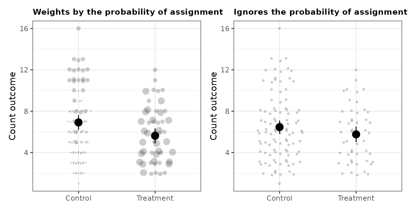
The two estimates differ, and the difference is the whole point of the weights:
bind_rows(
  weighted = tidy(lm_robust(Y ~ Z, weights = 1 / Z_cond_prob, data = blocked_experiment)),
  unweighted = tidy(lm_robust(Y ~ Z, data = blocked_experiment)),
  .id = "estimator"
) |>
  filter(term == "Z") |>
  select(estimator, estimate, std.error, conf.low, conf.high)
#> # A tibble: 2 × 5
#>   estimator  estimate std.error conf.low conf.high
#>   <chr>         <dbl>     <dbl>    <dbl>     <dbl>
#> 1 weighted     -1.28      0.507    -2.29    -0.283
#> 2 unweighted   -0.700     0.495    -1.68     0.279
Blocking can also be shown by faceting. Comparing treatment to control within each neighborhood follows the first guideline, because assignment was random within a neighborhood. Faceting the other way, so that neighborhoods are compared within each arm, invites a comparison across groups nobody randomized.
blocked_labelled <-
  blocked_experiment |>
  mutate(neighborhood_long = paste("Neighborhood", neighborhood),
         neighborhood_short = paste0("N", neighborhood))

by_block <-
  blocked_labelled |>
  group_by(condition, neighborhood_long, neighborhood_short) |>
  reframe(tidy(lm_robust(Y ~ 1))) |>
  mutate(Y = estimate)

good <-
  ggplot(blocked_labelled, aes(condition, Y)) +
  geom_point(position = position_sunflower(density = 1.5, aspect_ratio = 1),
             alpha = 0.2, stroke = 0) +
  geom_point(data = by_block, size = 3) +
  geom_errorbar(data = by_block, aes(ymin = conf.low, ymax = conf.high), width = 0) +
  facet_wrap(~ neighborhood_long) +
  labs(title = "Compares across randomly formed groups", x = NULL, y = "Count outcome")

bad <-
  ggplot(blocked_labelled, aes(neighborhood_short, Y)) +
  geom_point(position = position_sunflower(density = 1.5, aspect_ratio = 1),
             alpha = 0.2, stroke = 0) +
  geom_point(data = by_block, size = 3) +
  geom_errorbar(data = by_block, aes(ymin = conf.low, ymax = conf.high), width = 0) +
  facet_wrap(~ condition) +
  labs(title = "Compares across neighborhoods", x = NULL, y = "Count outcome")

good + bad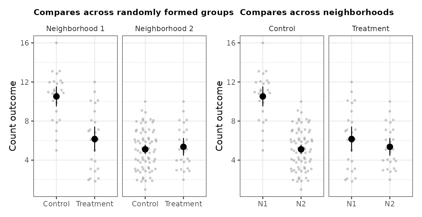
A cluster-randomized experiment
Thirty classes are assigned as whole clusters, so every student in a class shares its assignment. The effective sample size is 30, not 441, and standard errors that ignore the clustering are too small.
The strong graph plots the cluster averages rather than the students, with point size proportional to class size, and clusters the standard errors. Point size carries the design feature the chapter’s third guideline asks for.
A class average is a continuous number, so no two classes share a
position and the packing adjustments have nothing to pack:
position_circlepack() and position_sunflower()
both leave every point exactly where it is, by design. What is needed
here is a per-point spread, which is what the jitter family does, and
height = 0 keeps each class at its true average while
separating the classes horizontally.
class_level <-
  clustered_experiment |>
  group_by(class, condition, n_per_class) |>
  summarise(Y = mean(Y), .groups = "drop")

clustered_df <-
  clustered_experiment |>
  group_by(condition) |>
  reframe(tidy(lm_robust(Y ~ 1, clusters = class))) |>
  mutate(Y = estimate)

naive_df <-
  clustered_experiment |>
  group_by(condition) |>
  reframe(tidy(lm_robust(Y ~ 1))) |>
  mutate(Y = estimate)

good <-
  ggplot(class_level, aes(condition, Y)) +
  geom_point(aes(size = n_per_class),
             position = position_jitter_ellipse(width = 0.2, height = 0, seed = 1),
             alpha = 0.5, stroke = 0) +
  geom_point(data = clustered_df, size = 3) +
  geom_errorbar(data = clustered_df, aes(ymin = conf.low, ymax = conf.high), width = 0) +
  scale_size_continuous(range = c(1, 4)) +
  coord_cartesian(ylim = c(400, 1600)) +
  labs(title = "Clusters are the unit, and the size", x = NULL, y = "Class average score")

bad <-
  ggplot(clustered_experiment, aes(condition, Y)) +
  geom_point(position = position_jitter_ellipse(width = 0.25, height = 20, seed = 1),
             alpha = 0.2, stroke = 0) +
  geom_point(data = naive_df, size = 3) +
  geom_errorbar(data = naive_df, aes(ymin = conf.low, ymax = conf.high), width = 0) +
  coord_cartesian(ylim = c(400, 1600)) +
  labs(title = "Students are the unit", x = NULL, y = "Student score")

good + bad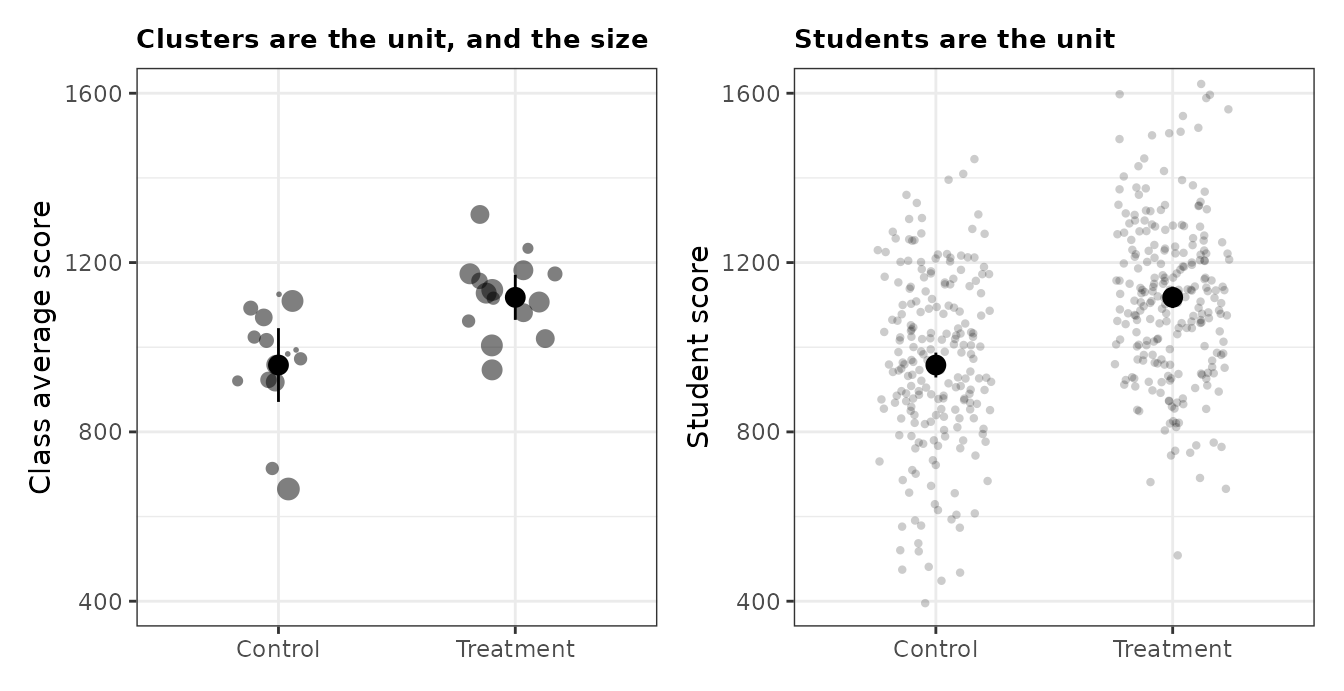
The intervals on the right are narrower, and wrongly so:
bind_rows(
  clustered = tidy(lm_robust(Y ~ condition, clusters = class, data = clustered_experiment)),
  naive = tidy(lm_robust(Y ~ condition, data = clustered_experiment)),
  .id = "estimator"
) |>
  filter(term == "conditionTreatment") |>
  select(estimator, estimate, std.error, conf.low, conf.high)
#> # A tibble: 2 × 5
#>   estimator estimate std.error conf.low conf.high
#>   <chr>        <dbl>     <dbl>    <dbl>     <dbl>
#> 1 clustered     160.      47.4     62.6      257.
#> 2 naive         160.      19.7    121.       199.
Covariate adjustment
A continuous pretreatment covariate predicts the outcome, so adjusting for it buys precision. The graph shows what the adjustment does by residualizing both the outcome and the treatment on the centred covariate and plotting the result beside the raw data. The estimate is the same in both panels and the uncertainty is not: the standard error falls from 0.25 to 0.09.
The outcome is continuous, so the points spread out vertically on
their own and no vayr position adjustment is called for.
Treatment is still binary in the unadjusted panel, which is why those
points form two stripes. Residualizing is what spreads them along the
horizontal axis on the right.
centred <- covariate_adjustment |> mutate(X_c = X - mean(X))

gg_df <-
  centred |>
  transmute(
    ID,
    Y_Adjusted = residuals(lm(Y ~ X_c + X_c:Z, data = centred)),
    Z_Adjusted = residuals(lm(Z ~ X_c, data = centred)),
    Y_Unadjusted = Y,
    Z_Unadjusted = Z
  ) |>
  pivot_longer(
    -ID,
    names_to = c("variable", "estimation"),
    names_sep = "_"
  ) |>
  pivot_wider(names_from = variable, values_from = value) |>
  mutate(estimation = factor(estimation, levels = c("Unadjusted", "Adjusted")))

ggplot(gg_df, aes(Z, Y)) +
  geom_point(alpha = 0.4, stroke = 0) +
  stat_smooth(method = "lm_robust", colour = "grey40") +
  facet_wrap(~ estimation, scales = "free") +
  labs(x = "Randomly assigned treatment", y = "Outcome")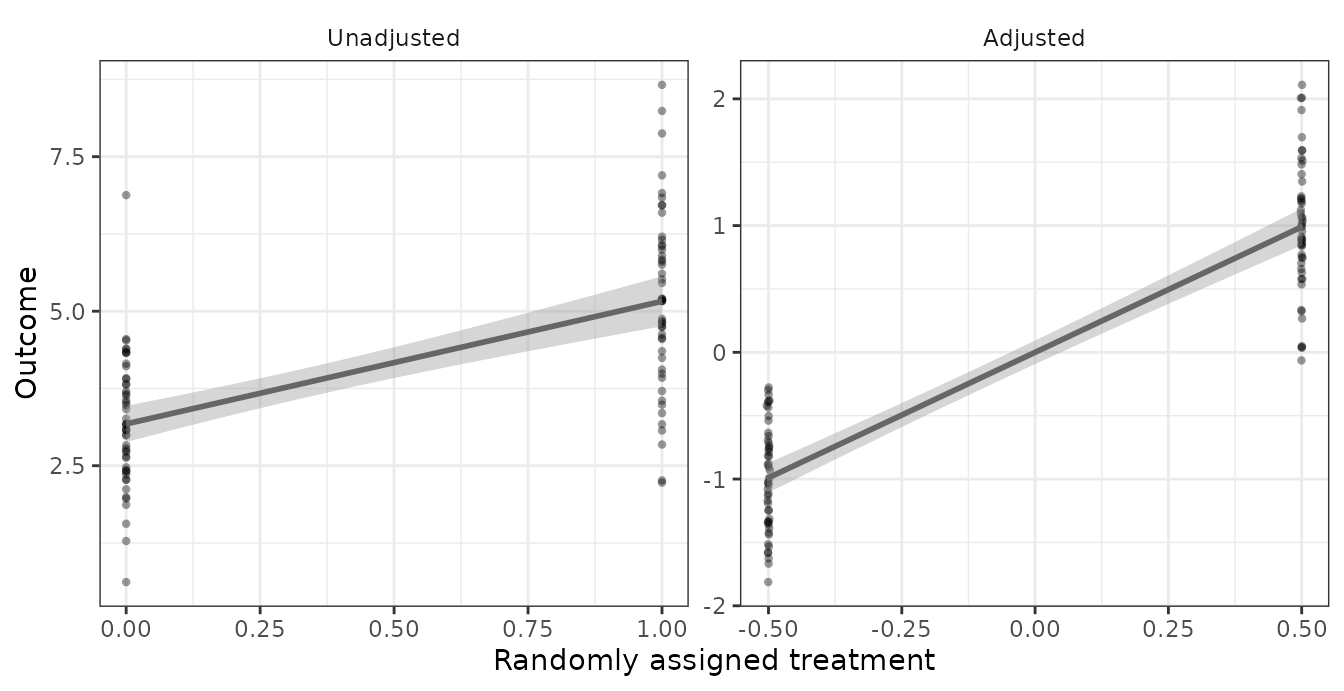
Residualizing recovers the covariate-adjusted estimate, which is the claim the figure is making:
bind_rows(
  lin = tidy(lm_lin(Y ~ Z, covariates = ~ X, data = covariate_adjustment)),
  residualized = tidy(lm_robust(Y ~ Z, data = filter(gg_df, estimation == "Adjusted"))),
  unadjusted = tidy(lm_robust(Y ~ Z, data = covariate_adjustment)),
  .id = "estimator"
) |>
  filter(term == "Z") |>
  select(estimator, estimate, std.error)
#> # A tibble: 3 × 3
#>   estimator    estimate std.error
#>   <chr>           <dbl>     <dbl>
#> 1 lin              1.98    0.0949
#> 2 residualized     1.98    0.0940
#> 3 unadjusted       1.98    0.252
An effect that varies with a covariate
The treatment effect is a nonlinear function of X. The
strong graph plots both fitted lines in data-space and labels them
directly, so a reader can see the data the lines are drawn through and
judge where the model fits and where it does not. The weak graph plots
the estimated conditional effect at a series of covariate values,
discarding the data entirely, which leaves a reader unable to tell that
the effect is being extrapolated where X is sparse.
Both axes are continuous again, so again no position adjustment is needed.
fit <- lm_robust(Y ~ condition * X, data = continuous_interaction)

label_df <- data.frame(
  X = c(1.1, 0.4),
  Y = c(-3.2, 7.2),
  condition = c("Control", "Treatment"),
  label = c("Control", "Treated")
)

good <-
  ggplot(continuous_interaction, aes(X, Y, group = condition, shape = condition)) +
  geom_point(alpha = 0.2, stroke = 0) +
  stat_smooth(method = "lm_robust", fullrange = TRUE, colour = "black") +
  geom_label(data = label_df, aes(label = label), size = 3) +
  coord_cartesian(xlim = c(-2, 2), ylim = c(-5, 10)) +
  labs(title = "Shows the model in data-space",
       x = "Pretreatment covariate", y = "Outcome")

# The conditional effect at x is the gap between the two fitted lines, which is
# a contrast rather than a fitted value, so it is marginaleffects' job. The df
# argument makes the intervals t-based, matching what tidy(lm_robust()) reports
# everywhere else in this vignette; marginaleffects defaults to a normal
# approximation.
cate_df <- comparisons(
  fit,
  variables = "condition",
  newdata = datagrid(X = seq(-2, 2, by = 0.25)),
  df = df.residual(fit)
)

bad <-
  ggplot(cate_df, aes(X, estimate)) +
  geom_hline(yintercept = 0, linetype = "dashed") +
  geom_point() +
  geom_errorbar(aes(ymin = conf.low, ymax = conf.high), width = 0) +
  coord_cartesian(xlim = c(-2, 2), ylim = c(-5, 10)) +
  labs(title = "Shows the estimates only",
       x = "Pretreatment covariate", y = "Conditional effect")

good + bad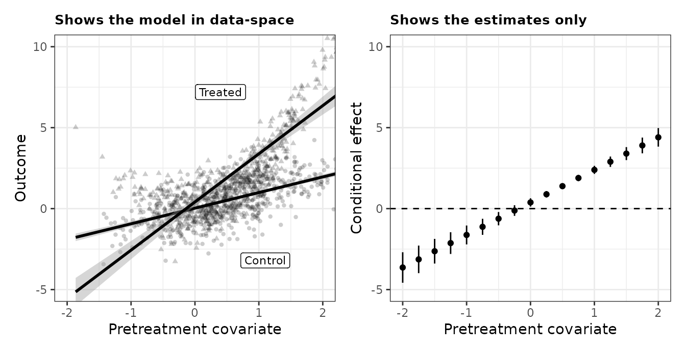
Noncompliance
Assignment does not determine receipt in either direction. Fifty of the 300 control subjects took the treatment anyway, and 100 of the 300 treated subjects did not take it. Receipt is a post-treatment variable, so conditioning on it invites post-treatment bias.
The strong graph shows the effect of assignment on two outcomes, receipt and turnout, side by side. Both comparisons are across randomly formed groups. The weak graph facets by receipt, which forms the groups after treatment: neither the comparison inside a facet nor the comparison across facets identifies anything.
Both outcomes are binary, so position_sunflower() again
does the work of making 600 points visible.
# The grouping column is named dv rather than outcome because estimatr's tidy()
# returns a column called outcome, which would collide and add a third facet.
long_df <-
  noncompliance_experiment |>
  pivot_longer(c(D, Y), names_to = "dv", values_to = "value") |>
  mutate(dv = factor(dv, c("D", "Y"), c("Treatment receipt", "Turnout")))

by_assignment <-
  long_df |>
  group_by(Z, dv) |>
  reframe(tidy(lm_robust(value ~ 1))) |>
  mutate(value = estimate)

good <-
  ggplot(long_df, aes(Z, value)) +
  geom_point(position = position_sunflower(density = 50, aspect_ratio = 3.3),
             alpha = 0.15, stroke = 0) +
  geom_point(data = by_assignment, size = 3) +
  geom_errorbar(data = by_assignment, aes(ymin = conf.low, ymax = conf.high), width = 0) +
  facet_wrap(~ dv) +
  scale_y_continuous(breaks = seq(0, 1, 0.25)) +
  coord_cartesian(ylim = c(-0.15, 1.15)) +
  labs(title = "By random assignment", x = NULL, y = "Outcome [1 = yes]")

received <-
  noncompliance_experiment |>
  mutate(D = factor(D, 0:1, c("Did not receive", "Did receive")))

by_receipt <-
  received |>
  group_by(Z, D) |>
  reframe(tidy(lm_robust(Y ~ 1))) |>
  mutate(Y = estimate)

bad <-
  ggplot(received, aes(Z, Y)) +
  geom_point(position = position_sunflower(density = 50, aspect_ratio = 3.3),
             alpha = 0.15, stroke = 0) +
  geom_point(data = by_receipt, size = 3) +
  geom_errorbar(data = by_receipt, aes(ymin = conf.low, ymax = conf.high), width = 0) +
  facet_wrap(~ D) +
  scale_y_continuous(breaks = seq(0, 1, 0.25)) +
  coord_cartesian(ylim = c(-0.15, 1.15)) +
  labs(title = "By treatment receipt", x = NULL, y = "Turnout [1 = yes]")

good + bad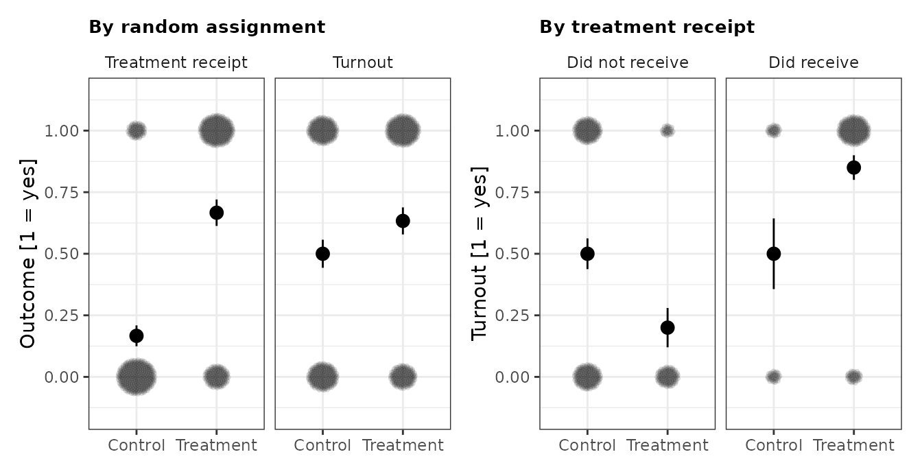
Attrition
Nineteen of 200 subjects have a missing outcome, and missingness is related to the potential outcomes, so dropping them conditions on a post-treatment variable. Extreme value bounds avoid that by imputing the logical best and worst cases instead. The lower bound imputes the smallest possible outcome for missing treated subjects and the largest for missing control subjects; the upper bound reverses it.
impute_extreme_values() does the imputation. It takes
the outcome’s logical range, which for a seven-point Likert item is 1 to
7 whether or not anybody in the sample used both endpoints, and it flags
which points are observed and which are imputed. Mapping that flag to
colour and shape keeps the distinction legible in
grayscale.
bounded <- impute_extreme_values(
  attrition_experiment,
  outcome = "Y",
  assignment = "Z",
  range = c(1, 7)
)

bounded <- bounded |> mutate(condition = if_else(Z == 1, "Treatment", "Control"))

bound_means <-
  bounded |>
  group_by(condition, scenario) |>
  reframe(tidy(lm_robust(Y ~ 1))) |>
  mutate(Y = estimate)

ggplot(bounded, aes(condition, Y)) +
  geom_point(aes(colour = imputed, shape = imputed),
             position = position_sunflower(density = 45, aspect_ratio = 0.34),
             alpha = 0.5, stroke = 0) +
  geom_point(data = bound_means, size = 3) +
  geom_errorbar(data = bound_means, aes(ymin = conf.low, ymax = conf.high), width = 0) +
  facet_wrap(~ scenario) +
  scale_colour_manual(values = c("#205C8A", "#C67800")) +
  scale_y_continuous(breaks = 1:7) +
  labs(x = NULL, y = "Outcome [1: strongly disagree, 7: strongly agree]") +
  theme(legend.position = "bottom", legend.title = element_blank())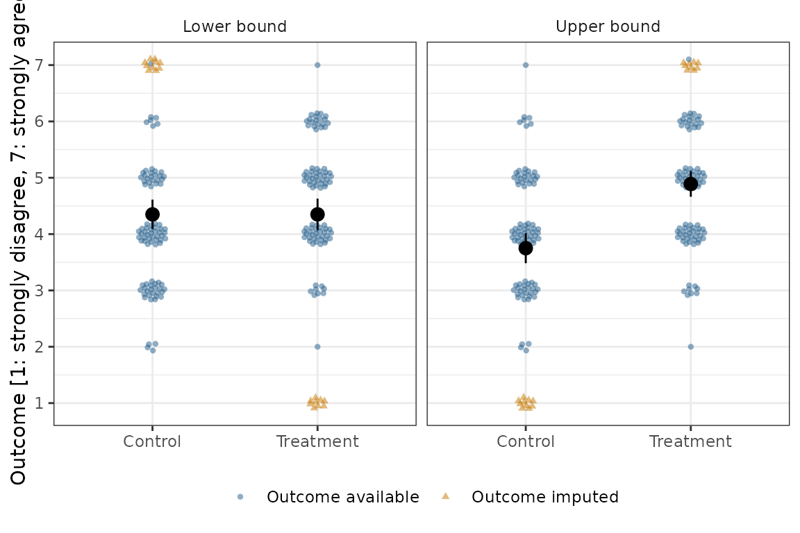
The two scenarios bracket the effect. Under the worst case the estimate is essentially zero, and under the best case it is a little over a full scale point, so the data are consistent with any effect in between:
bounded |>
  group_by(scenario) |>
  reframe(tidy(lm_robust(Y ~ Z))) |>
  filter(term == "Z") |>
  select(scenario, estimate, std.error, conf.low, conf.high)
#> # A tibble: 2 × 5
#>   scenario    estimate std.error conf.low conf.high
#>   <fct>          <dbl>     <dbl>    <dbl>     <dbl>
#> 1 Lower bound 5.14e-16     0.193   -0.381     0.381
#> 2 Upper bound 1.14e+ 0     0.177    0.792     1.49